UX Designer
Peace Love Happy

TIMELINE
May 2022 (2 week sprint)
PLATFORM
Responsive e-commerce site
MY ROLE
Researcher
Analysist
Interface Designer
Intro
Peace Love Happy is a small local business with an online shop that caters to their body and skin care products.
I had the opportunity to work with Peace Love Happy to recreate their customer's experience when shopping on their e-commerce site.
I led the design, user testing and development of this project from start to finish.

The Challenge
For someone shopping online for body and skin care products, it can be a struggle to see the details and information of the products, or suggestions on what to buy.
Through extensive user research, I soon came to realize that there is much more that comes to creating a positive and memorable experience when shopping online.
The Process
To better understand the pain points I conducted a series of interviews, task analysis and did comparative and competitive analysis to see where the site needed improvement.
I synthesized several problems and solutions through affinity mapping, sketching and usability tests on the prototype I developed.

Here is an example of how I compared Peace Love Happy to other competitors in order to visually see were the information architecture was lacking on the current site.
What the Research Showed
After gathering my research, I realized It wasn't just about seeing ingredient lists and product images. Without a consistent and cohesive layout, shoppers would become frustrated and their experience would not end positively.
Here were some key issues that stood out the most:

1) Icon Consistency
-
Icon placement, colors and size were not consistent with each other.
-
Unfamiliar shape for the “cart” icon which made it difficult to spot or understand.
-
The "search" function was displayed as a button squeezed in between the others icons (made it hard to find)

2) Error notifications
-
Error notifications did not stand out due to inconsistencies with the color pallet.
-
Indicators for out of stock items were small and blended into the site bar menu.
-
“In stock” or “out of stock” text was very small and stayed in black which caused it to not stand out.
3) Product Details
-
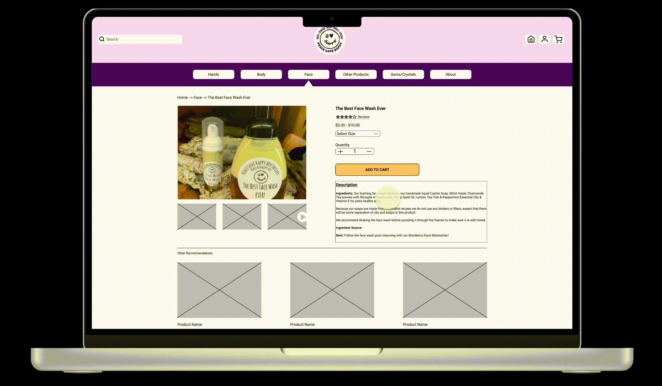
Users want to see multiple images of the product bottle, texture of product and images of packaging
-
They also desired to not only see a list of ingredients, but how these ingredients were sourced.
Solution
Now understanding the details and visually seeing what the shoppers were going through on the current site, it was time to brain storm solutions and put it all together in my redesign.
-
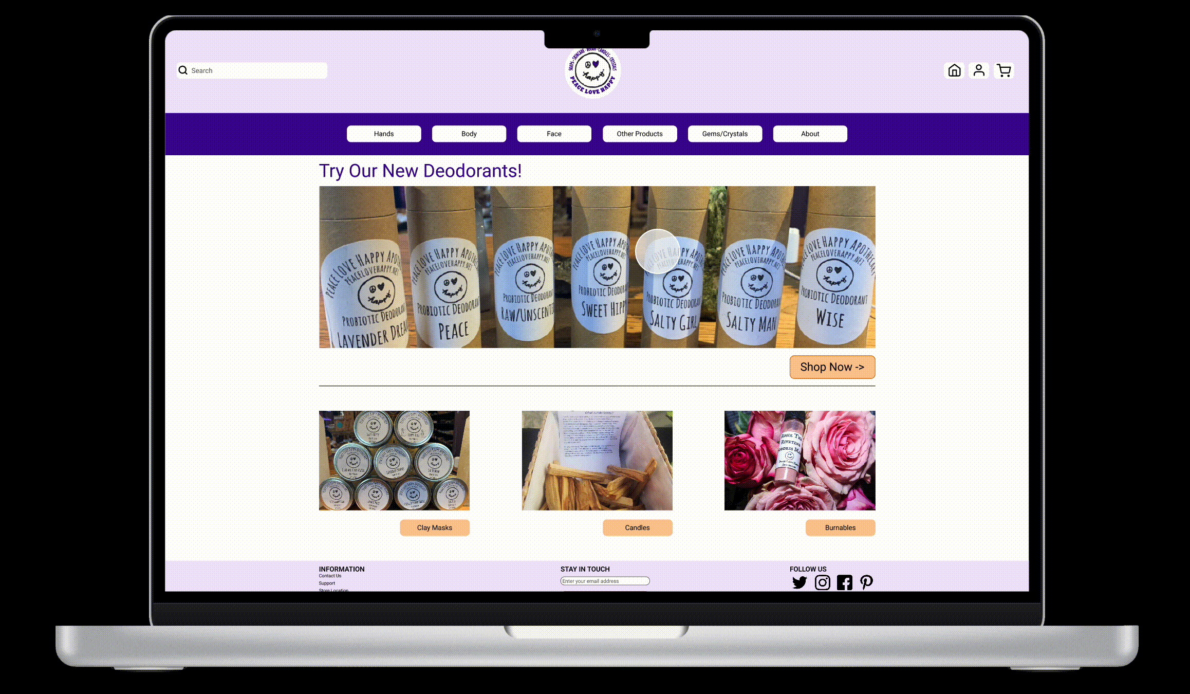
I created a design that visually felt more inviting by incorporating the color scheme of the logo throughout the site.
-
Card sorting helped me organize the site bar and categorize products that made more sense.
-
Placing "Call to Action" buttons gave me a goal to help the user decide on where to go without playing a guessing game.
The other big goal I wanted to tackle was the error notifications.
By maintaining consistent color schemes and noticeable font size, it was easy for users to understand what was in or out of stock.
Results
Once I had my mid-fidelity prototype up and running, I ran several usability tests to gain more feedback.
Ultimately my goal was to find out if I made an enjoyable and easy experience for shopping online for skin and body care products.
What Worked
-
Overall it was an enjoyable experience and the users loved the new color pallet
-
The time it took to complete the same tasks as before decreased by 80%
-
It was much easier to find/notices icons and search bar
What to Work On
-
Continue improving error notifications on items that are out of stock or find a way to avoid error notifications all together.
-
Find a photographer to retake images of products due to current photos being dark and low quality and take additional photos to show the color and texture of products.
-
Build out the site map in more detail with drop down menus to view what is under each main category.
If you would like to test out my mid-fidelity prototype yourself, please clink the image below!
