UX Designer
Absolute Love Adoptions

TIMELINE
June 2022 (2 week sprint)
FORMAT
Website
MY ROLE
Lead UX Researcher
Associate UI Designer
Intro
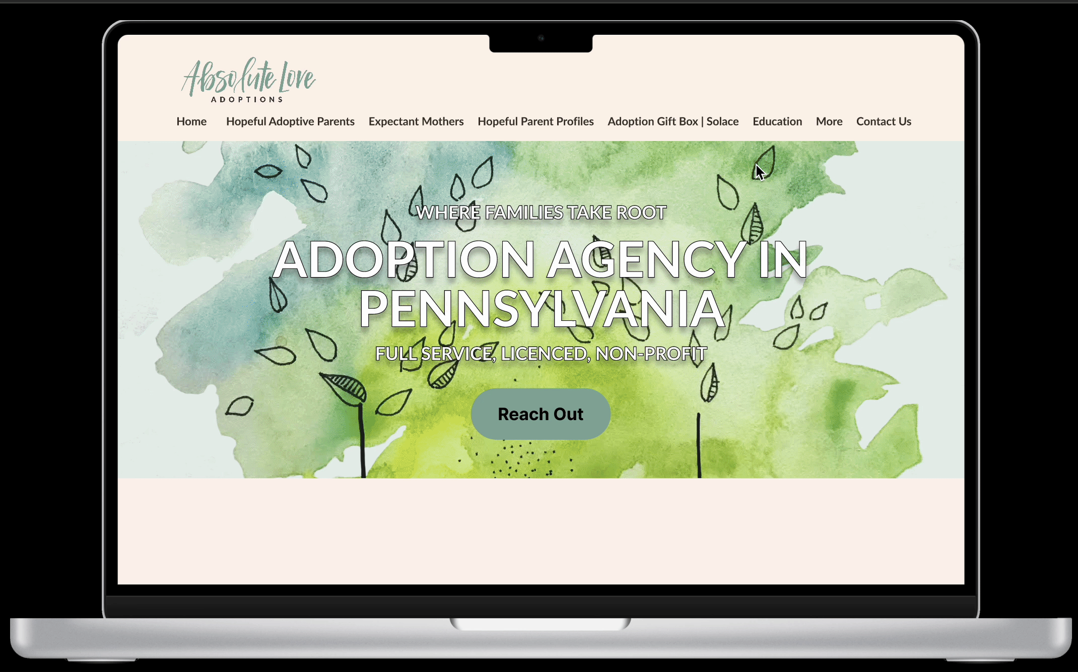
Absolute Love Adoptions is a non-profit adoption agency based in Pennsylvania with a mission to cultivate an adoption-conscious community.
Business Problem
Absolute Love Adoptions requires all prospective adoptive parents complete 20 hours of education learning.
However, ALA does not currently have their own educational platform for these lessons.
Goal
-
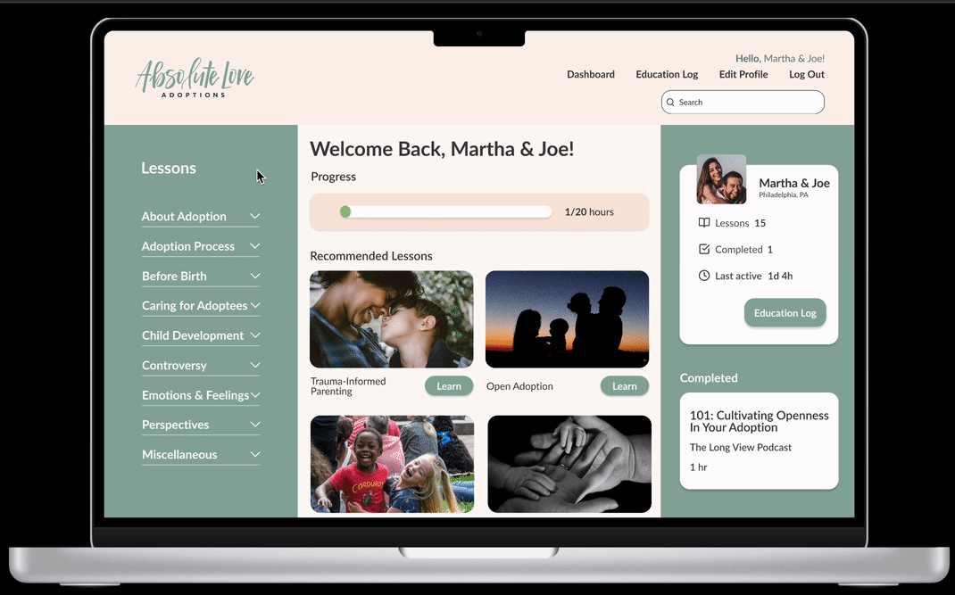
To design an intuitive education portal so that users can complete the required 20 hours of learning.
-
To design an education log so that users can document reflection for each lesson completed and the client can assess learning.
Process

Competitive Analysis
Since this educational portal did not exist for ALA, I wanted to see what other adoptive organizations were doing to compare the features available to users.
Here is what stood out the most:

-
Login Process to create individualized learning experiences for users
-
Progress bar to keep users engaged and help users estimate time of completion
-
Search box to create a clear and efficient experience
Survey Findings
From the kickoff meeting, I knew our target audience would start with parents who have gone through the adoptive process.
In order to gain insight, I sent out a survey which generated 16 responses.
Key insights:
-
100% were married at the time of adoption
-
47% felt the instructions and education they received were not clear
-
31% did not receive any form of adoption education through their agency
-
27% did not feel supported throughout their adoption journey
-
There was variability in the learning topics covered
User Interviews
The survey answered surface-level questions but I wanted to dig deeper. I wanted to find out how the lack of education made the parents feel and why.
I interviewed 4 of the survey respondents and this is what stood out the most:
-
“I had an open adoption.”
-
“I felt unprepared with my adoption due to lack of education.”
-
“I had to do my own learning outside of the training I was provided.”
-
“Overall, my adoption was hectic and frustrating.”
The Problem
Prospective adoptive parents need structure and comprehensive education to feel adequately prepared to adopt and parent a child.
Digging Deeper
With a clear problem to ponder, I asked myself several questions to help guide myself into the next direction.
-
How might we make adoption education less frustrating for prospective adoptive parents?
-
How might we help prospective adoptive families feel more prepared to parent their child?
-
How might we educate prospective adoptive parents on staying connected with birth mothers?
Organization
Absolute Love adoption had their own archive of links to articles, books, videos and podcasts to provide to their prospective adoptive parents.
I needed to figure out how to easily categorize those links.
Card Sorting
My teammate conducted an open card sort study and analyzed 13 responses.
This card sort would help to not only understand how users grouped similar topics, but also show which category labels made sense to them.
.png)
The above graph is a dendrogram with a threshold of 60% agreement on grouped topics with 12 categories.
This would be the lead into building out the educational portal’s sitemap.
Site Map
Out of the 12 initial categories generated from the dendrogram, a total of 9 categories were grouped together to keep the sitemap minimal and easy to navigate.
Here you can also see the parent categories and subcategories laid out.
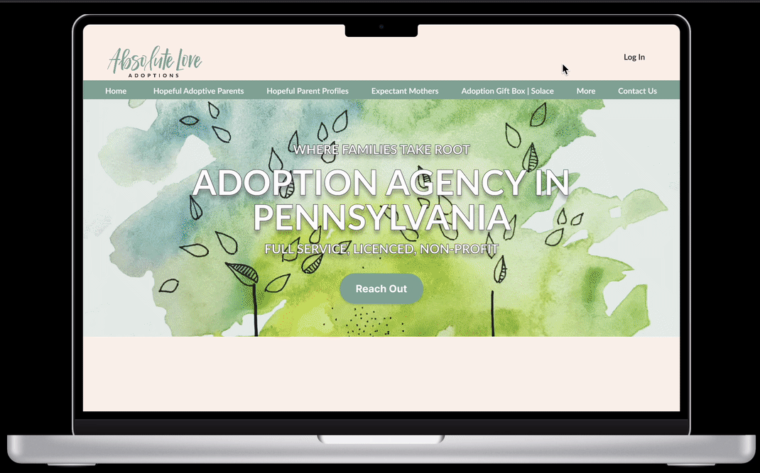
Initially I placed an “Education” button added to the primary navigation that would then lead to a login screen.

During usability testing, 6 out of 7 users looked for a Login button when asked to find the education button.
For the hi-fidelity prototype, I revised the site map to have a Login button on the home page that would direct prospective adoptive parents to log into the education portal.

Lo-Fi Prototype Testing
In order to save time and resources, usability tests were conducted early on in order to detect critical usability issues and explore different layout concepts for the hi-fidelity prototype.
Key usability test insights:
-
6:7 users looked for a Login button on the home page
-
6:7 users were confused about the wording, “Add Impression,” taken from the current education log
-
3:7 users mistook the progress bar for a button
-
3:7 users expected to have a close/X button on popup
-
1:7 users stated text was small and difficult to read
-
1:7 users reported uncertainty of their location in the education portal
The Solution
Our team incorporated feedback from the usability testing into the high-fidelity prototype to showcase our solution.
Key components of the high-fidelity prototype:
-
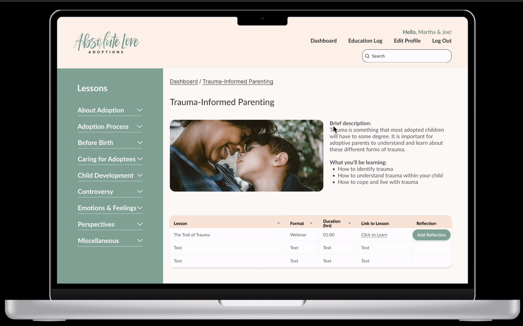
While working with the lead UI Designer, I created an accordion drop down menu for the parent categories and subcategories for easy navigation.
-
I implemented the color scheme throughout the design to create a welcoming feeling to the user.
-
A progress bar was included to easily show the user how far along they are with their learning.
-
Most importantly, an Education Log was built out to document reflections of the user’s learning and to provide proof of learning to the client.
Next Steps
-
2nd round of usability tests to find how the site makes the user feel and where to continue to improve the navigation.
-
Hand off to developers and collaborate to buff out any areas of concern within the design.
What I Learned
-
It is much easier and efficient to start usability tests early on to save time and resources.
-
The more card sorts, the better. It is extremely difficult to organize and label topics if you do not know how the topics speak to the user.
-
Adoption can be a very sensitive topic. To gain quality research, it is best to listen with intent and openness to help users feel safe and at ease.
Final Thoughts
During this project, it was confirmed to me that this was the reason I wanted to get into UI/UX Design.
Working with clients who have a goal to help their users is what brings out my passion to problem solve and help make user’s lives easier.
This was a challenging but very exciting project to work on and I look forward to working with more non-profits in the future.
Click image to view prototype
